To create a peaceful home environment, you can choose from various soothing color palettes that promote relaxation. Soft neutrals like beige and taupe offer a calming backdrop. Calming blues, including soft sky shades, enhance serenity, while earthy greens ground your space and evoke a sense of harmony. Gentle pinks bring warmth, and tranquil grays cultivate peace. Light lavenders transform areas into sanctuaries, while crisp whites create an invigorating, airy feel. Subtle yellows add cheer without overwhelming, and muted terracottas introduce cozy warmth. Each palette can inspire calm, making your home a peaceful retreat. Explore further to discover more options.
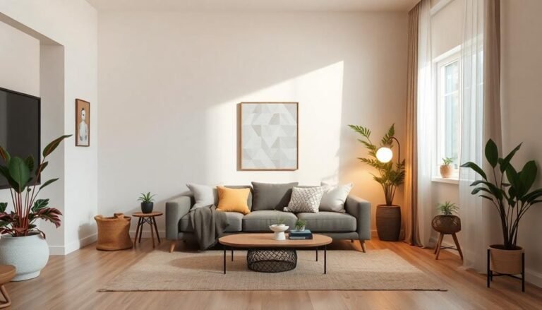
Soft Neutrals

Soft neutrals create a calming backdrop that invites relaxation into your home. These hues, such as soft beige, gentle greys, and creamy whites, work harmoniously together, allowing for a serene atmosphere. When you choose soft neutrals, you're not just picking colors; you're creating a space that promotes peace and serenity. This approach aligns beautifully with the rising trend of biophilic design, where integrating natural elements enhances calmness.
Incorporating soft neutrals into your living areas can be simple. Start with your walls; a fresh coat of light taupe or dove grey can instantly elevate the mood. You can complement these shades with furniture in similar tones, creating a cohesive look. Don't forget about textures—layering soft fabrics like linen or cotton will add depth, making the space feel inviting.
Accessories play an essential role, too. Think about adding natural elements, like wooden decor or potted plants, which can bring warmth and life to your neutral palette. This combination fosters a feeling of calm, encouraging you to unwind after a long day.
Ultimately, when you embrace soft neutrals, you're not just decorating; you're cultivating a sanctuary in your home, a place where you can escape the chaos of daily life.
Calming Blues

Incorporating calming blues into your home can enhance the serene atmosphere established by soft neutrals. These hues evoke feelings of serenity and peace, making them an excellent choice for spaces where relaxation is key. You might consider using shades like soft sky blue or muted teal, as they can create an inviting backdrop for your living areas or bedrooms. Additionally, selecting quality bedding and furniture in these calming shades can further enhance comfort and style, contributing to an overall sense of well-being. When selecting calming blues, think about the overall mood you want to achieve. For instance, a light blue paired with white accents can make a room feel airy and spacious, while deeper navy tones can add a touch of sophistication. Try painting an accent wall or using blue textiles, such as cushions or throws, to introduce these shades subtly.
Don't forget about the power of natural light! A bright room can enhance the beauty of calming blues, reflecting soothing vibes throughout your home. You could also combine these colors with elements like wood or stone to create a balanced look. By thoughtfully integrating calming blues into your decor, you'll not only boost your home's aesthetic appeal but also foster a peaceful and rejuvenating atmosphere. For more inspiration on creative decor ideas, consider how different decor styles can interact with your chosen color palette.
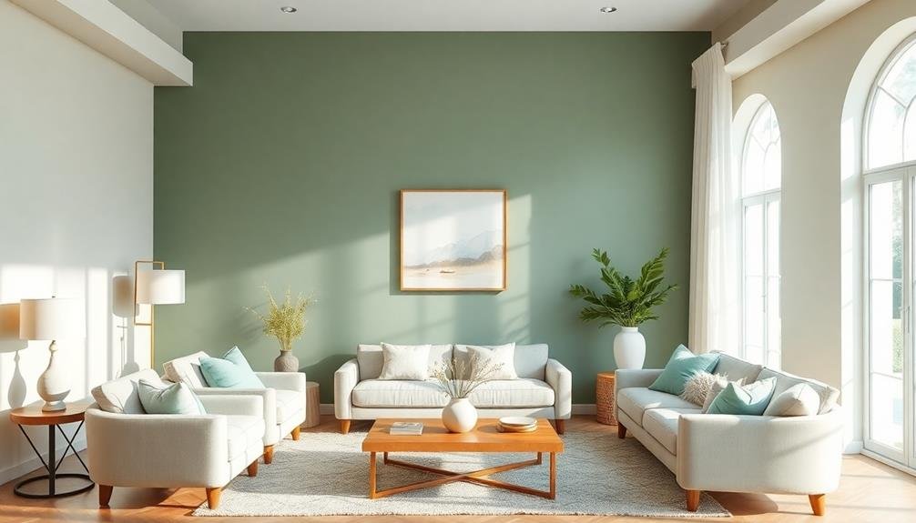
Earthy Greens

Bringing earthy greens into your home can create a grounded and harmonious environment. These colors, reminiscent of nature, evoke feelings of stability and peace. From deep forest hues to soft sage, earthy greens can transform your space, making it feel more inviting and serene. Incorporating plants can further enhance this effect, as they not only improve air quality but also add a vibrant touch to your decor, making it easier to breathe easier with houseplants.
Incorporating these shades into your decor can be as simple as painting an accent wall or adding green furnishings, such as cushions and throws. Consider using plants, too; they not only enhance the aesthetic but also improve air quality. Imagine walking into a room adorned with leafy indoor plants and rich green textiles, instantly soothing your senses.
You might also explore combining earthy greens with neutral tones like beige or soft browns, creating a balanced palette that feels cohesive and calming. A well-placed piece of art featuring these colors can serve as a focal point, drawing the eye and adding depth to your space.
Gentle Pinks

Gentle pinks can add a touch of warmth and peace to your home, creating a soothing atmosphere that complements the earthy greens you've already embraced. This color palette evokes feelings of comfort and calmness, making it ideal for spaces where you want to unwind. Incorporating gentle pinks can be as simple as adding soft furnishings like throw pillows, blankets, or curtains.
You might also consider painting an accent wall in a soft blush or peach tone. These hues can create a harmonious backdrop for your existing decor, allowing the earthy greens to shine while adding a layer of warmth to the room.
In your bedroom, gentle pinks can promote relaxation, making it the perfect retreat after a long day. Picture a cozy reading nook adorned with gentle pink cushions, paired with your favorite earthy green plants.
For a more subtle approach, you could introduce gentle pink through artwork or decorative accents. This way, you maintain a peaceful ambiance while revitalizing the space with a hint of color. Embrace the calming effects of gentle pinks, and watch your home transform into a serene haven.
Serene Grays

How can serene grays enhance your home's peacefulness? By incorporating this versatile color into your living spaces, you create a calming atmosphere that invites relaxation. Serene grays evoke a sense of calmness and sophistication, making them perfect for bedrooms, living rooms, or any area where you seek solace.
Imagine wrapping your walls in a soft, muted gray, complemented by plush furnishings in varying shades of gray. This monochromatic scheme promotes a cohesive look, while still allowing for subtle contrasts that can energize the space. Pairing serene grays with natural textures, such as wood or stone, further enhances the ambiance, bringing the soothing elements of nature indoors.
You might also consider adding pops of color, like soft blues or greens, to create interest without overwhelming the senses. When used thoughtfully, serene grays can serve as a backdrop for personal touches—artwork or decor—that express your style while maintaining a peaceful environment.
Ultimately, bringing serene grays into your home can help you cultivate a sanctuary that feels both inviting and restful, providing a perfect retreat from the hustle and bustle of daily life. Embrace the calming power of gray, and transform your space into a calm haven.
Warm Taupes

While serene grays set a soothing tone, warm taupes introduce a cozy warmth that can enhance your home's calmness. This versatile color creates an inviting atmosphere, making it an ideal choice for spaces where you want to unwind. Imagine walking into a living room painted in warm taupe; the soft, earthy hue instantly makes you feel at home, promoting relaxation and comfort.
When you choose warm taupes, you can create a seamless blend with other colors. Pairing taupe with soft whites or muted greens can elevate your space, adding depth while maintaining peace. This combination is perfect for creating a serene bedroom or a peaceful reading nook.
Incorporating warm taupes in your decor isn't just about paint; think about furniture, textiles, and accessories. A plush taupe sofa or cozy throw pillows can complement your color scheme, offering both style and comfort. You might even consider adding wooden elements, as they harmonize beautifully with taupe, enhancing that warm, natural vibe.
Ultimately, warm taupes invite you to embrace a peaceful home, allowing you to recharge and find peace amidst the busyness of everyday life.
Light Lavenders

Light lavenders can transform your space into a serene sanctuary, offering a delicate touch of color that soothes the mind. This gentle hue evokes feelings of calmness and peace, making it an ideal choice for bedrooms, living areas, or any place where relaxation is essential. When you incorporate light lavenders into your home, consider pairing them with soft whites or muted grays to create a harmonious palette that enhances the soothing effect.
You might choose to paint an accent wall in a light lavender shade, or you could incorporate this color through accessories like throw pillows, curtains, or artwork. Imagine a cozy reading nook adorned with lavender cushions, where you can unwind with a good book. The color encourages mindfulness and calmness, making it easier to escape the daily hustle.
Additionally, light lavenders can beautifully complement natural materials like wood, adding warmth to your decor. When combined with lush greenery, this palette creates a revitalizing and inviting atmosphere. Overall, light lavenders invite a sense of serenity into your home, ensuring that every room radiates a welcoming and peaceful vibe. Embrace this calming color for a serene haven that reflects your personal style.
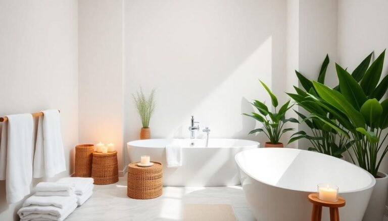
Crisp Whites

Crisp whites create an invigorating and timeless backdrop that can instantly elevate any space in your home. When you incorporate crisp white hues into your design, you're inviting a sense of calm and clarity. This color not only reflects light beautifully but also makes rooms feel larger and airier, providing a blank canvas for your cherished décor.
Imagine walking into a living room adorned with white walls, complemented by soft furnishings in various textures. You'll notice how the light dances off the surfaces, creating an enchanting atmosphere. Crisp whites can also serve as a unifying element, allowing you to mix and match other colors seamlessly. For instance, pair white with natural wood tones or vibrant accent colors to achieve a balanced yet dynamic look.
Don't forget about the importance of layering. Incorporating different shades of white—like soft ivory, bright snow, or cool alabaster—can add depth and interest to your space. You might find that incorporating crisp whites not only enhances your home's aesthetic but also promotes a peaceful mindset, making it a perfect choice for any serene environment you wish to create.
Subtle Yellows

Three shades of subtle yellow can transform your home into a warm and inviting sanctuary. These gentle tones evoke feelings of serenity and happiness, perfect for creating a peaceful atmosphere. You can choose from soft buttery yellows, light lemon hues, or pale sunflower shades that each add a unique warmth to your space.
Here are four ways to incorporate subtle yellows into your home:
- Accent Walls: Paint one wall in a soft yellow to create a focal point without overwhelming the room. This adds a cheerful touch while keeping the overall vibe calm.
- Textiles: Use throw pillows, blankets, or curtains in gentle yellow tones. They can soften a room's appearance and complement existing decor.
- Artwork: Choose pieces that incorporate subtle yellows. This can subtly brighten your space and tie together different elements.
- Accessories: Incorporate yellow vases, lamps, or decorative items. These small touches can infuse a sense of warmth and cheerfulness into your home.
Muted Terracottas

Muted terracottas bring a sense of grounded warmth to your home, creating a cozy and inviting atmosphere. This palette, with its soft earthy tones, evokes the natural beauty of clay and terracotta pottery, making it perfect for creating a serene space. You can easily incorporate muted terracotta hues into your decor through wall paint, textiles, or decorative accents.
Consider pairing these warm colors with crisp whites or soft creams to enhance the richness while keeping the overall look light and airy. For instance, a muted terracotta sofa can become a stunning focal point when paired with light, textured pillows. You might also explore terracotta-inspired artwork or pottery to further immerse your space in this calming palette.
Additionally, plants thrive in environments adorned with these tones, as the colors reflect the warmth of nature. A few lush green plants can complement the muted terracottas beautifully, creating a balanced and harmonious feel. Fundamentally, using muted terracottas in your home not only adds warmth but also fosters a sense of peace and serenity, making it an ideal choice for any space meant for relaxation.
Frequently Asked Questions
How Do I Choose the Right Palette for My Room Size?
Choosing the right color palette for your room size involves considering a few key factors. If your room's small, light colors can make it feel larger and more open. Conversely, darker shades can create a cozy atmosphere in spacious areas. You should also think about the room's natural light; bright palettes can enhance sunny spaces, while muted tones can soften overly bright light. Ultimately, balance is key in achieving a harmonious look.
Can I Mix Different Palettes in One Space?
Imagine mixing different flavors to create a unique dish; blending color palettes can yield the same delightful results. You can absolutely mix palettes in one space, but balance is key. Choose a dominant palette to unify the room, then incorporate accents from your secondary choices. For instance, if you select soft blues, you might add touches of warm yellows or greens. Just guarantee they complement each other, creating a harmonious and inviting atmosphere.
What Finishes Work Best With Relaxing Color Palettes?
When you're working with relaxing color palettes, opt for finishes that complement the soothing tones. Soft matte or eggshell finishes often enhance serenity, reflecting light gently without harsh glare. You might consider using natural materials, like wood or stone, which add warmth. Additionally, incorporating textiles such as linen or cotton in soft hues can create a cohesive, calming effect. Each finish should harmonize with your chosen colors to maintain a peaceful ambiance.
How Do Lighting Conditions Affect Color Perception?
Imagine stepping into a room that feels completely different based on the light. Lighting conditions greatly influence how you perceive color; for instance, natural light can make hues appear more vibrant, while artificial light might soften them. If you've noticed a shade looking warmer during the day but cooler at night, that's the effect of light. Adjusting your light sources can enhance or diminish the calming atmosphere you're trying to create.
Are There Specific Colors to Avoid for Tranquility?
When seeking serenity, it's wise to avoid overly bright or saturated colors, like neon hues or intense reds. These colors can stimulate energy or provoke anxiety, disrupting a peaceful atmosphere. Instead, consider softer tones, like pastels or earth shades, which promote calmness. For instance, while a bold orange may feel lively, a gentle peach can create a serene environment. By choosing your colors carefully, you can foster a more relaxing space in your home.